All Media Artist Paper - Tests & Trials
0
Posted on 22nd September 2025 by Papermill Direct
Filed under All Papercraft Tutorials, Reviews of Products
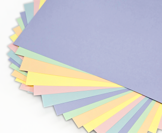
Today, we’re diving into the world of all media artist paper—a true gem for any artist looking to explore its limitless possibilities. If you've ever struggled to find the right paper to support your artistic creations, you’ll want to stick around as we test the versatility of our All Media Artist Paper.
All Media Artist paper is designed to work with a myriad of mediums, and during our latest testing sessions, we explored how it responds to an array of artistic tools. From vibrant watercolour paints to soft, blended pastel strokes, we think the All Media Artist Paper held its own beautifully, but we’ll let you see the results for yourself!
The Benefits of Textured Paper
One of the standout features of all media artist paper is its texture. Textured cards offer a unique surface that can enhance your artwork by adding depth and character. For instance, soft pastels thrive on textured surfaces, allowing for more control and fluidity in application. However, not all media work equally well with textured cards. While watercolours and markers may fare better on smoother surfaces, artists who gravitate towards tactile experiences will find textured paper a friend in their creative journey.
Why Heavy-Weight Card Matters
When embarking on intricate, heavily layered projects, the weight of your paper matters tremendously. The all media artist paper boasts a heavier GSM (grams per square meter), making it ideal for artists who love to build up their work. Thicker paper minimizes the risk of tearing or pilling, providing peace of mind as you experiment with depth and texture in your pieces.
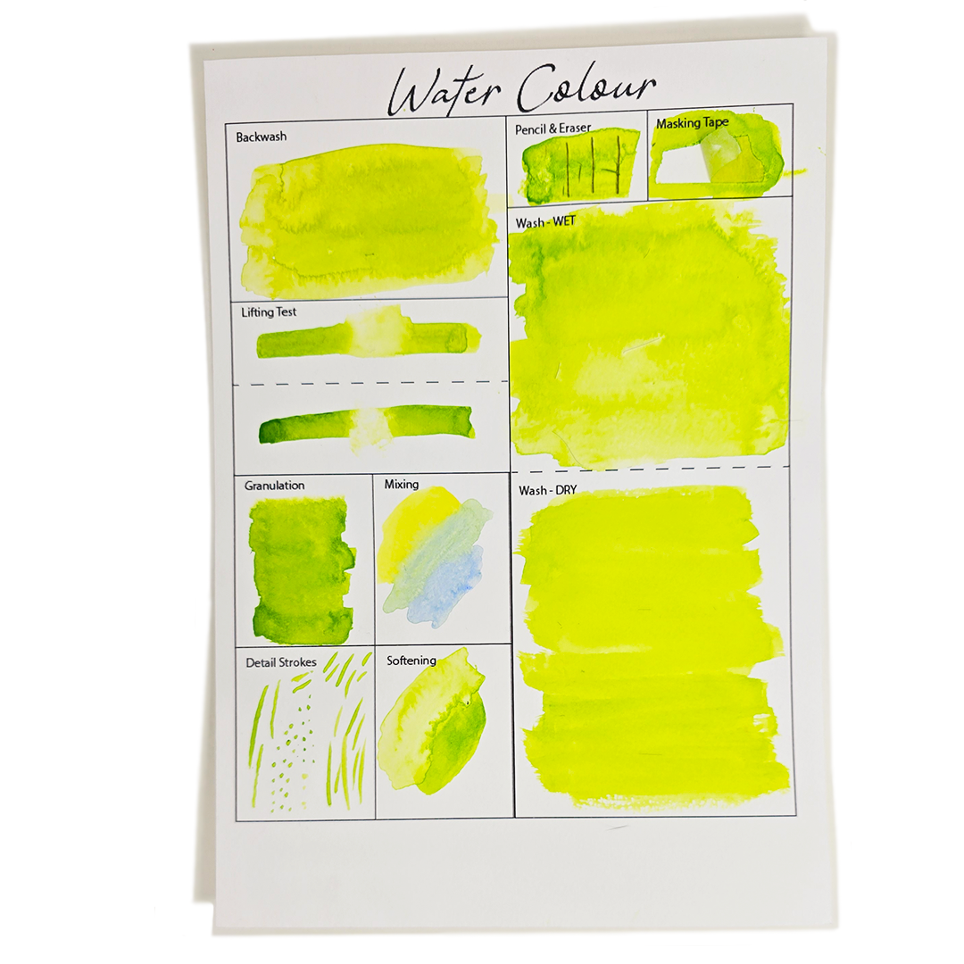
Watercolour
The paper’s ability to handle layering without warping is remarkable. We experimented with a number of different techniques, and the absorbent yet resilient surface maintained its integrity, allowing for stunning washes and detailed work.
Backwash - Create an even wash on your paper using your chosen colour. Allow it to dry partially but not completely. Then while the first wash is still damp, apply a second colour or more of the same colour to the area.
The texture of the All Media Artist Paper played a crucial role in achieving beautiful backwashes. We noticed that the paint bloomed wonderfully across the surface, with the paper's texture aiding in controlling the spread of the bloom.
Lifting Test - The watercolor lifting technique involves using a damp, clean brush or other tool to remove watercolor pigment, creating lighter areas, highlights, or even correcting mistakes.
We tested listing the watercolour paint with a damp, clean paintbrush and a damp, clean cloth. Our testing revealed that using a damp, clean cloth was the most effective method for removing paint, while a damp paintbrush still allowed us to lift areas as needed.
Granulation Test - The granulation watercolor technique creates a textured, mottled effect by using granulating paints allowing heavier particles to settle into the paper's texture as the water evaporates.
The texture of the All Media Artist Paper enhanced the granulation of the paint when using the wet-on-wet technique.
Mixing - Apply the first colour, then whilst wet, apply a second colour next to the first and overlap in the middle to see how the two colours mix together on the page
Mixing paints on All Media Artist Paper is a joy and very easy to do. The texture of the card will show through if you use a light amount of paint on the card, too.
Detail Strokes – With a fine brush, apply thin strokes to the page as you would when applying details to a painting,
The crispness and definition of fine strokes on All Media Artist Paper are remarkable. Whether you're highlighting delicate features or adding atmospheric elements, this paper responds beautifully, ensuring your artistic vision is realized with clarity.
Softening - you can soften a dry edge by gently brushing it with a clean, damp brush, starting away from the edge and moving towards it, then moving away before lifting the brush.
Softening pre-dried paint can sometimes be a challenging aspect of watercolour painting, but not with All Media Artist Paper. The card's heavyweight effortlessly accommodates multiple layers of paint and water, allowing for seamless transitions and smooth gradations.
Wash—A watercolour wash is a thin, uniform layer of transparent paint applied with a large brush to spread a significant amount of paint mixture over the paper, either on dry or pre-wetted paper.
When applying washes, we found that the results varied significantly between wet-on-wet and wet-on-dry techniques. The former allowed the paper's texture to surface intriguingly, creating captivating blooms and inviting granulation in selected areas. In contrast, the wet-on-dry approach delivered a more even, smooth coverage
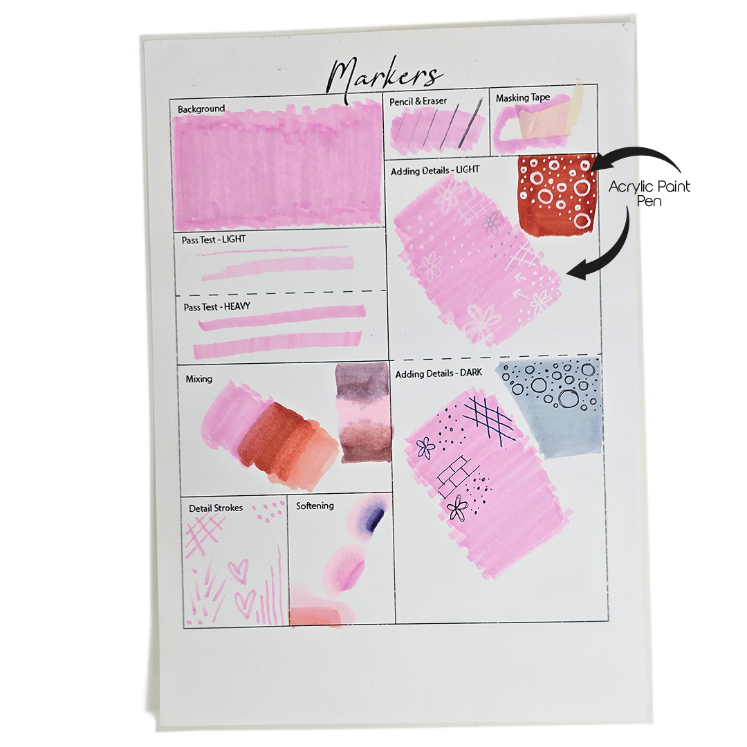
Alcohol Markers
For those who enjoy bold lines and vibrant colors, the All Media Artist Paper absorbs marker ink beautifully with minimal feathering, allowing for crisp, sharp details.
Background – How does the marker appear when colouring a large space
When it comes to colouring large spaces, how a marker lays down its ink is crucial. I found that the markers I used covered the All Media Card beautifully, with no texture peeking through the vibrant hues.
Pass Test - Apply a single, firm stroke of the marker to the paper to see how the ink spreads and dries.
Notably, the markers did not feather, and bleed-through was minimal—occurring only under heavy pressure or after applying multiple layers.
Blending – Using two different coloured markers, blend to see how well they blend, does the card pill or deteriorate
The slight texture of the card offered minimal interference, creating a harmonious gradient without compromising the integrity of the paper. While I observed some bleed-through on the back due to layering, the front retained its professional finish.
Detail Strokes – using the smallest point of your marker, create fine lines
Detail strokes are vital for adding finesse to your artwork. Using the smallest point of the marker, I created intricate lines that emerged crisp and clear. The lack of feathering allows for finer strokes and details in your art work or colouring.
Softening – Can dry edges be softened
Just as with blending, softening the edges on the All Media Card proved effective with multiple layers, allowing for depth without compromising the integrity of the card.
Adding Details – Light – Colouring in a section of the block and leaving it to dry. Then, with a fine liner in a lighter colour than the marker, create details or patterns over the top of the coloured section.
I used a few different white pens and one silver to test how well adding finer details on top of the marker would look. Most of the white pens adhered to the card and marker well, but did not pop against it. I used an Acrylic white pen, which added the clearest contrast.
Adding Details – Dark - As above, but use a fine liner of a darker colour than the section coloured in with a marker.
All the darker pens I used on top of the marker worked well and appeared clearly.
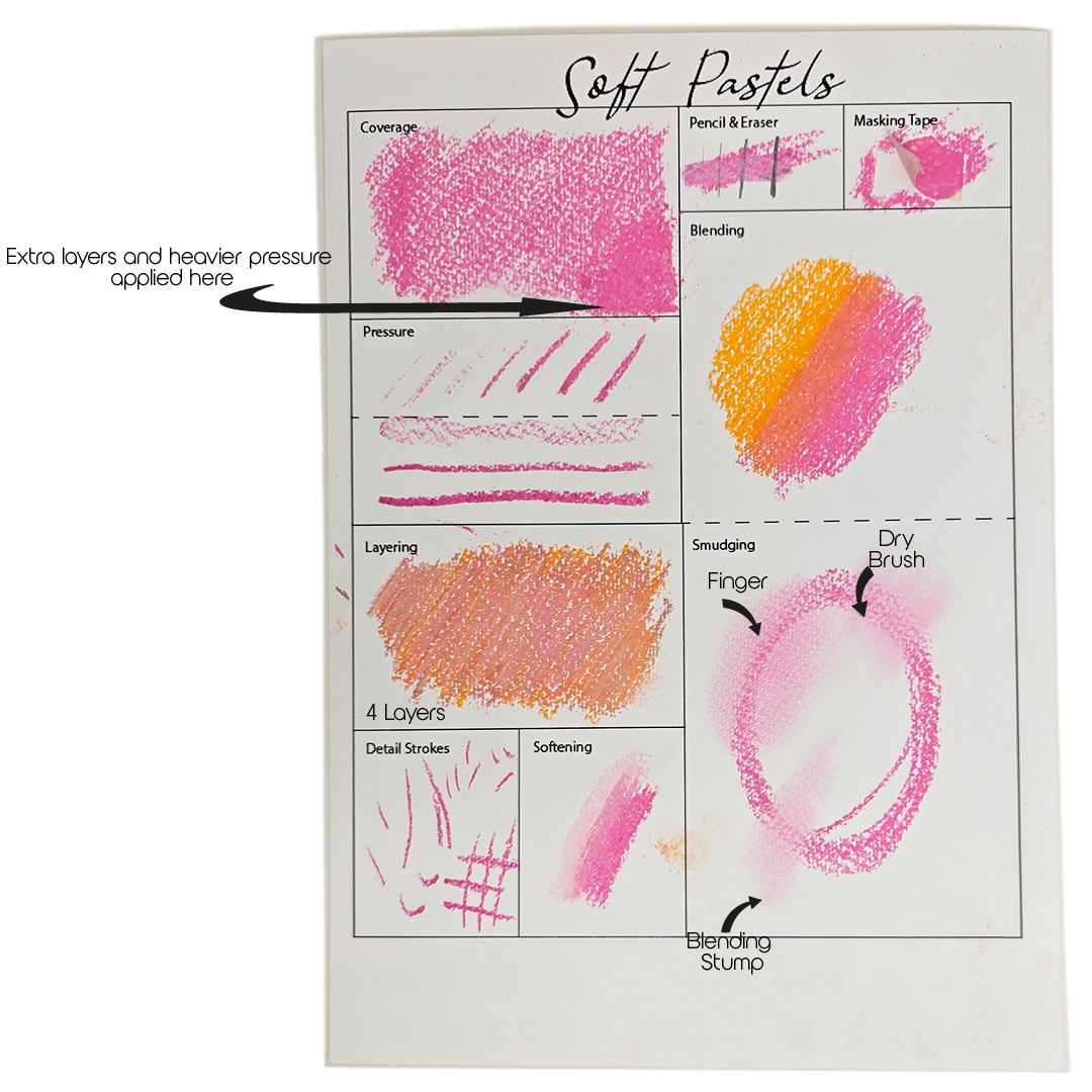
Soft Pastels
Exploring soft pastels is an exhilarating journey of discovery. The nuances in coverage, layering, and blending can unlock new levels of creativity. So, whether you’re looking to make bold statements or soft, dreamlike scenes, I encourage you to take these insights and have a go with soft pastels and All Media Artist Paper.
Coverage – how well does the soft pastel cover the paper, is there white peeking through?
With just one layer, the rich texture of the card can still peek through, leaving a hint of its original surface. However, as I pressed down harder and added more layers, the vibrant hues began to fully envelop the card, creating a beautifully solid colour with minimal textural interference.
Pressure – Apply several lines to the box increasing the amount of pressure you use each time, how does the pastel appear on the card with more or less pressure.
Each line I created varied in appearance based on the pressure I applied. Lighter strokes allowed the card’s texture to come through, while heavier strokes on longer lines started to cover the surface more effectively.
Layering – How many layers of pastel can be applied to the card before it stops adhering to the card, use different colours for each layer and count as you are doing so.
I experimented with four layers, each in a different colour, applying them lightly meant some of the card’s texture is still peeking through. Each colour intermingled slightly, creating a dynamic and rich surface. As you layer, keep in mind that there’s a limit to how much pastel can adhere to the card. Striking that perfect balance can lead to stunning visual effects in your artwork.
Detail Strokes – Using the corner of your soft pastel or smallest edge create detail lines as you would when adding details to an image.
Using the corner or smallest edge of the pastel for detail strokes yields crisp lines, although the card’s texture can play a role in how defined those lines appear. It’s a reminder that although soft pastels are a medium known for their softness, precision can still be achieved.
Softening – Apply a dark colour to thew box then using a white or lighter colour try to soften the edges of darker colour
When I applied a lighter pink over a darker pink, the card held well against the pressure, allowing for a smooth gradient effect. This technique can greatly enhance your work, giving depth and a graceful flow.
Blending – Apply two colours next to each other, then blend in the middle
Blending two adjacent colors is another essential skill when working with soft pastels. As I applied the colors side by side and combined them in the middle, the surface showed minimal texture while still looking vibrant.
Smudging – Draw a circle using a soft pastel then using your finger or other tool test how the pastel smudges on the page
Drawing a circle and then using my finger, a blending stump, and a dry paintbrush to smudge revealed interesting differences. While my finger highlighted the card’s texture, the brush allowed for a more subtle and softer finish. It’s intriguing to see how a simple smudge can morph the artwork, extending beyond the original boundaries when done with the right tool.
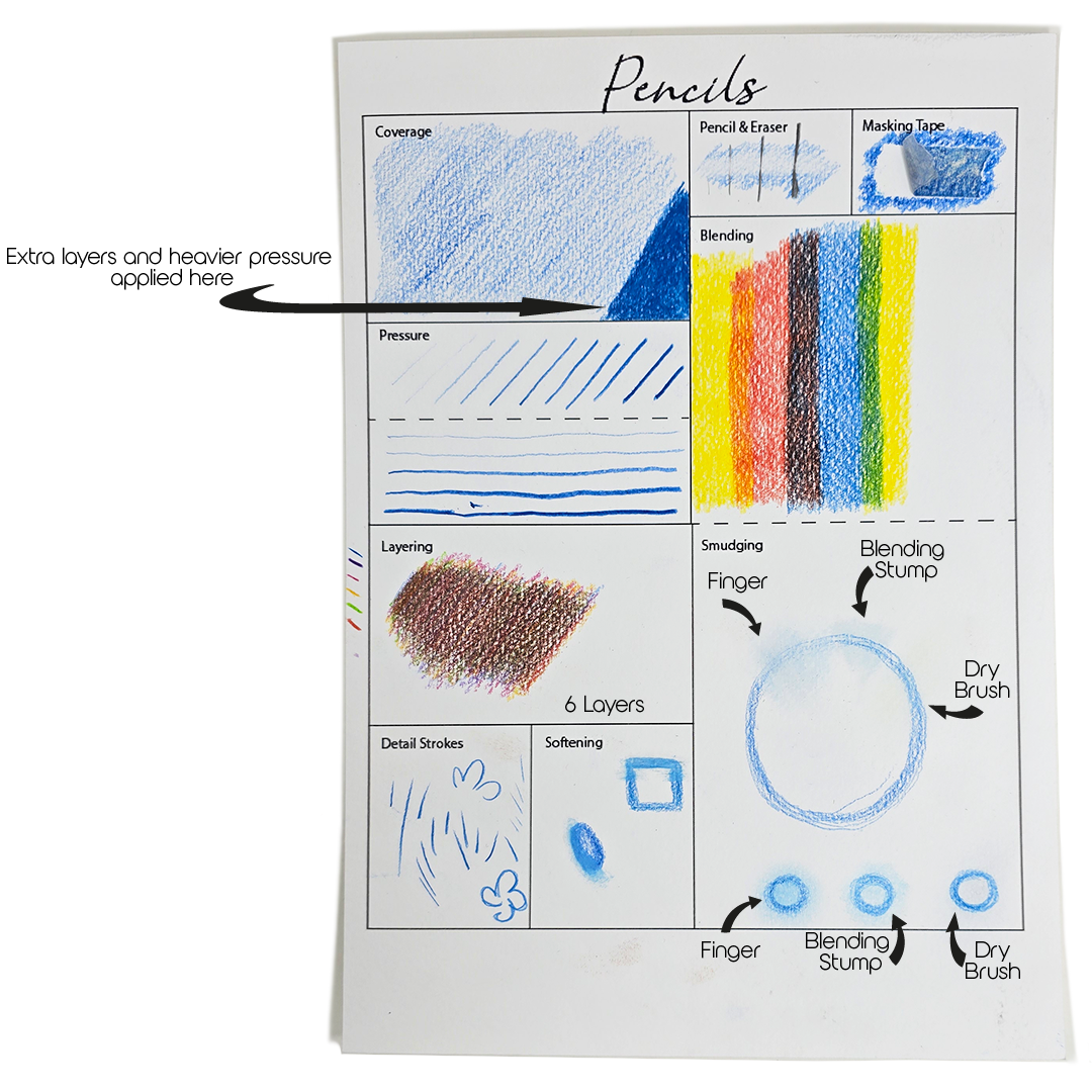
Coloured Pencils
The texture of this paper provides just the right amount of grip, enabling smooth application and excellent blending. Plus, the colours pop beautifully against its surface!
Coverage - how well do the pencils cover the paper? Is there white peeking through?
In our tests, a single light layer of colour will still leave some white peeking through, revealing the paper’s texture. However, as you apply repeated layers, you can achieve almost full coverage,
Pressure - Apply several lines to the box, increasing the amount of pressure you use each time.
By applying increasing pressure with each stroke, you can see how the intensity of the colour deepens while simultaneously reducing the visibility of the paper’s texture.
Layering - How many layers of pastel can be applied to the card before it stops adhering to the card? Use different colours for each layer and count as you are doing so.
We applied 6 layers of different coloured pencils to the card before it became difficult to differentiate. We applied each layer lightly, so the texture of the card is still peeping through in some sections.
Detail Strokes – Sharpen your pencil to a fine point to create detail lines as you would when adding details to an image.
With a sharp point, the pencil adheres to the card clearly, and fine detail strokes look crisp against the textured card.
Softening - Apply a dark colour to the box, then using a white or lighter colour try to soften the edges of the darker colour
I found that it took a few layers to truly soften the transitions, but the sturdy 300gsm paper held up beautifully.
Blending - Apply two colours next to each other, then blend in the middle.
When applying two adjacent colours and blending them in the middle, the results are both captivating and rich. The texture of the card supports this process, allowing for a delightful interplay of hue where the subtlety of each colour shines through. It adds an interesting visual complexity to your work that a single flat colour simply can’t provide.
Smudging - Draw a circle using a pencil, then using your finger or other tool, test how the pencil smudges on the page.
I used my fingers, a blending stump, and a dry paintbrush to test how well the pencils smudge on the card. While my finger provided the most significant smudging impact, the blending stump offered me precision, allowing for controlled transitions.

Nobody has commented yet
Be the first to comment on this article by using the form below.